library(tidyverse)

# SPORTS
nba_stats <- read_csv("https://shorturl.at/eDL02")

# HEALTH
heart_disease <- read_csv("https://shorturl.at/borZ7")Data visualization practice with ggplot
Released on Monday, June 12, 2023
Read in data
Let’s start again by reading in the data from last lab using the read_csv() function after loading the tidyverse:
The NBA dataset contains information about players from the 2022 season.
The heart disease dataset was collected by a health insurance company gathering information on subscribers who had claims resulting from ischemic (coronary) heart disease. The dataset contains total costs and types of services for one year. The variables in this dataset include:
| Variable | Description |
|---|---|
| Cost | Total cost of subscriber claims |
| Age | Age of claimant |
| Gender | Gender of claimant |
| Interventions | Number of interventions / procedures given to patient |
| Drugs | Factor describing number of drugs prescribed to patient |
| ERVisit | Number of ER visits |
| Complications | Factor describing number of complications experienced by the patient |
| Comorbidities | Number of comorbidities the patient had |
| Duration | Duration of treatment |
| id | Index variable |
Peeking at the data
Write code that displays the column names of your dataset (nba_stats or heart_disease). Also, look at the first six rows of your dataset to get an idea of what these variables look like. Which variables are quantitative, and which are categorical?
# INSERT CODE HERE(SPORTS)
The NBA dataset has no indicator variables, so it doesn’t need any further processing at this time. (But feel free to check out the health section to see how we would deal with that)
(HEALTH)
As it turns out, even though Drugs and Complications appear to be quantitative - they are actually categorical variables. Specifically, Drugs represents the categorized number of drugs prescribed: 0 if none, 1 if one, 2 if more than one; Complications indicates whether or not the subscriber had complications: 1 if yes, 0 if no. To address this issue for our plots, we can manually recode the variables as factors. For instance, we can modify the Complications variable using a simple if-else statement:
heart_disease <- heart_disease %>%
  mutate(Complications = ifelse(Complications == 0, "No", "Yes"))
This is a quick fix to the binary indicator variable since, by default, R orders factor variables in alphabetical order. In this case, “No” is before “Yes” because “N” is before “Y”. We may not want variables in alphabetical order however - we will see how to change this in lecture.
Next, to update the Drugs variable we will use the fct_recode() function which allows us to manually change the labels of a factor variable:
heart_disease <- heart_disease %>%
  mutate(Drugs = fct_recode(as.factor(Drugs),
                            "None" = "0", "One" = "1", "More than one" = "2"))
Why did we have to specify as.factor(Drugs) first then place the numbers in quotation marks?
(ALL TOGETHER NOW)
Always make a bar chart…
Now we’ll use the ggplot() function to create a bar plot of one of the categorical variables. To make things easier, we provide the code for you to do this below; just uncomment the code and run it to create the bar plot. In what follows, you must answer some questions about the code and plot.
(SPORTS)
Make a bar plot of position in the NBA dataset.
# Create the bar plot of position:
# nba_stats %>%
#   ggplot(aes(x = position)) +
#   geom_bar(fill = "darkblue") +
#   labs(title = "Number of NBA players by position",
#        x = "Position", y = "Number of players",
#        caption = "Source: Basketball-Reference.com")
(HEALTH)
Make a bar plot of Drugs in the heart disease dataset.
# Create the bar plot of Drugs:
# heart_disease %>%
#   ggplot(aes(x = Drugs)) +
#   geom_bar(fill = "darkblue") +
#   labs(title = "Number of patients by number of drugs",
#        x = "Number of drugs", y = "Number of patients")
(ALL TOGETHER NOW)
Now, answer the following questions about the code and plot:
In general,
ggplot()code takes the following format:ggplot(blank1, aes(x = blank2)). Looking at the above code, what kind ofRobject shouldblank1be, and what shouldblank2be?What do you think the line
geom_bar(fill = "darkblue")does?What do you think the remaining lines of code do (contained in
labs())?
More area plots (but bar plots are better!)
Now we’ll make a few other area plots:
spine chart
pie chart
rose diagram
Your goal for this part is to create each of these plots. These plots can be created by copy-and-pasting the bar plot code from above and modifying it slightly. Follow these directions to create each of these plots:
- spine chart: First, copy-and-paste the bar plot code from above. Then, delete the
fill = "darkblue"withingeom_bar(). Finally, withinggplot(), replaceaes(x = position)withaes(x = "", fill = position)(SPORTS), or replaceaes(x = Drugs)withaes(x = "", fill = Drugs)(HEALTH). Also, change the labels inlabs()if necessary.
# PUT YOUR SPINE CHART CODE HERE- pie chart: First, copy-and-paste the spine chart code you just made. Then, after
geom_bar(), “add”coord_polar("y"). Be sure to put plus signs before and aftercoord_polar("y"). Also, change the labels inlabs()if necessary.
# PUT YOUR PIE CHART CODE HERE- rose diagram: First, copy-and-paste your original bar plot code. Then, after
geom_bar(fill = "darkblue"), “add”coord_polar() + scale_y_sqrt(). Be sure to put plus signs before and aftercoord_polar() + scale_y_sqrt(). Also, change the labels inlabs()if necessary. After you make the rose diagram: In 1-2 sentences, what do you thinkscale_y_sqrt()does, and what is a benefit to includingscale_y_sqrt()when making the rose diagram?
# PUT YOUR ROSE DIAGRAM CODE HERENotes on colors in plots
Three types of color scales to work with:
- Qualitative: distinguishing discrete items that don’t have an order (nominal categorical). Colors should be distinct and equal with none standing out unless otherwise desired for emphasis.
- Do NOT use a discrete scale on a continuous variable
- Sequential: when data values are mapped to one shade, e.g., for an ordered categorical variable or low to high continuous variable
- Do NOT use a sequential scale on an unordered variable
- Divergent: think of it as two sequential scales with a natural midpoint midpoint could represent 0 (assuming +/- values) or 50% if your data spans the full scale
- Do NOT use a divergent scale on data without natural midpoint
Options for ggplot2 colors
The default color scheme is pretty bad to put it bluntly, but ggplot2 has ColorBrewer built in which makes it easy to customize your color scales.
(SPORTS)
For instance, we can make a scatterplot with three_pointers on the y-axis and offensive_rebounds on the x-axis and using the geom_point() layer with each point colored by position:
nba_stats %>%
  ggplot(aes(x = offensive_rebounds, y = three_pointers,
             color = position)) +
  geom_point(alpha = 0.5) +
  labs(x = "Offensive rebounds", y = "Three-pointers",
       color = "Position") +
  theme_bw()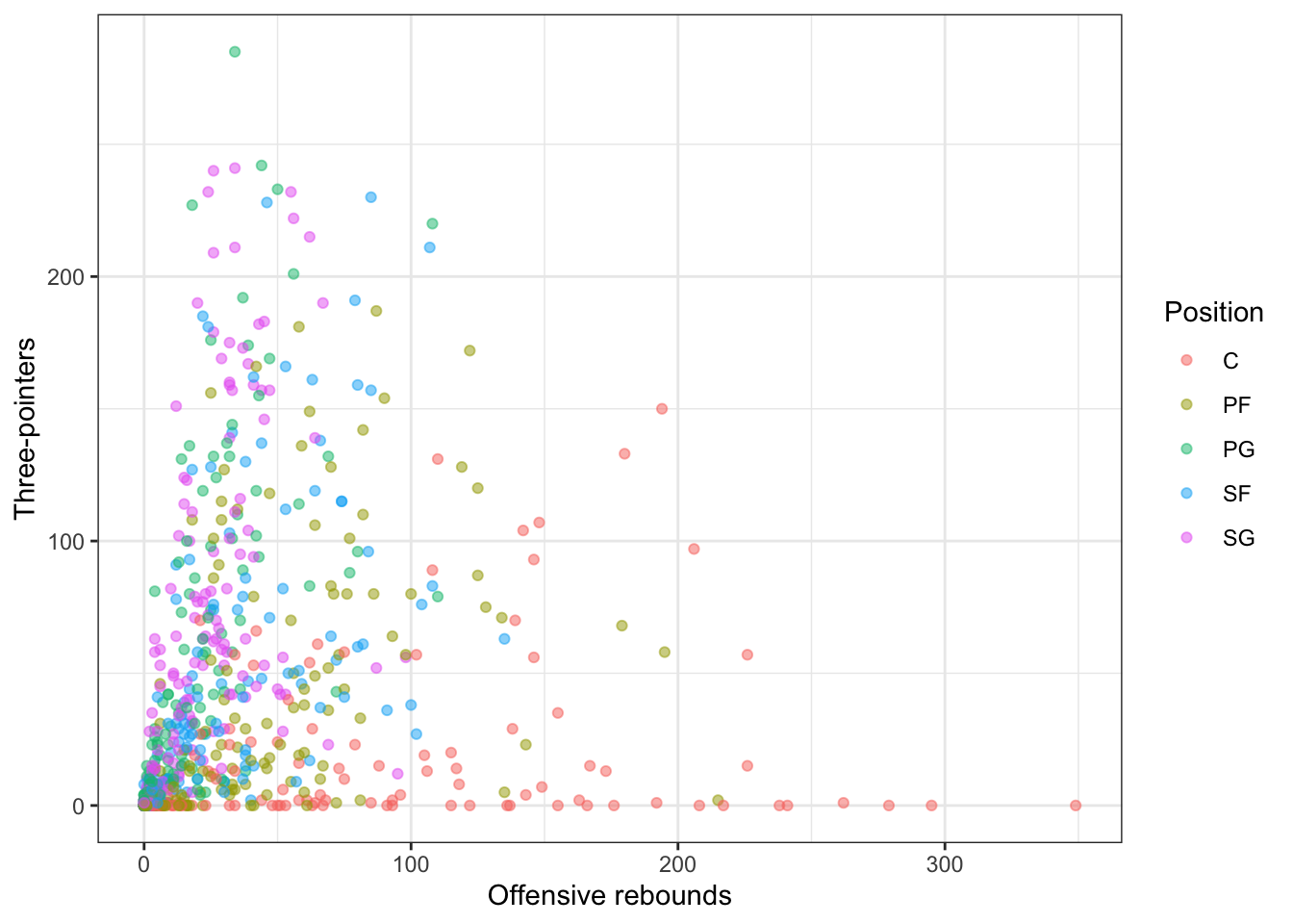
What does alpha change? We can change the color plot for this plot using scale_color_brewer() function:
nba_stats %>%
  ggplot(aes(x = offensive_rebounds, y = three_pointers,
             color = position)) +
  geom_point(alpha = 0.5) +
  scale_color_brewer(palette = "Set2") +
  labs(x = "Offensive rebounds", y = "Three-pointers",
       color = "Position") +
  theme_bw()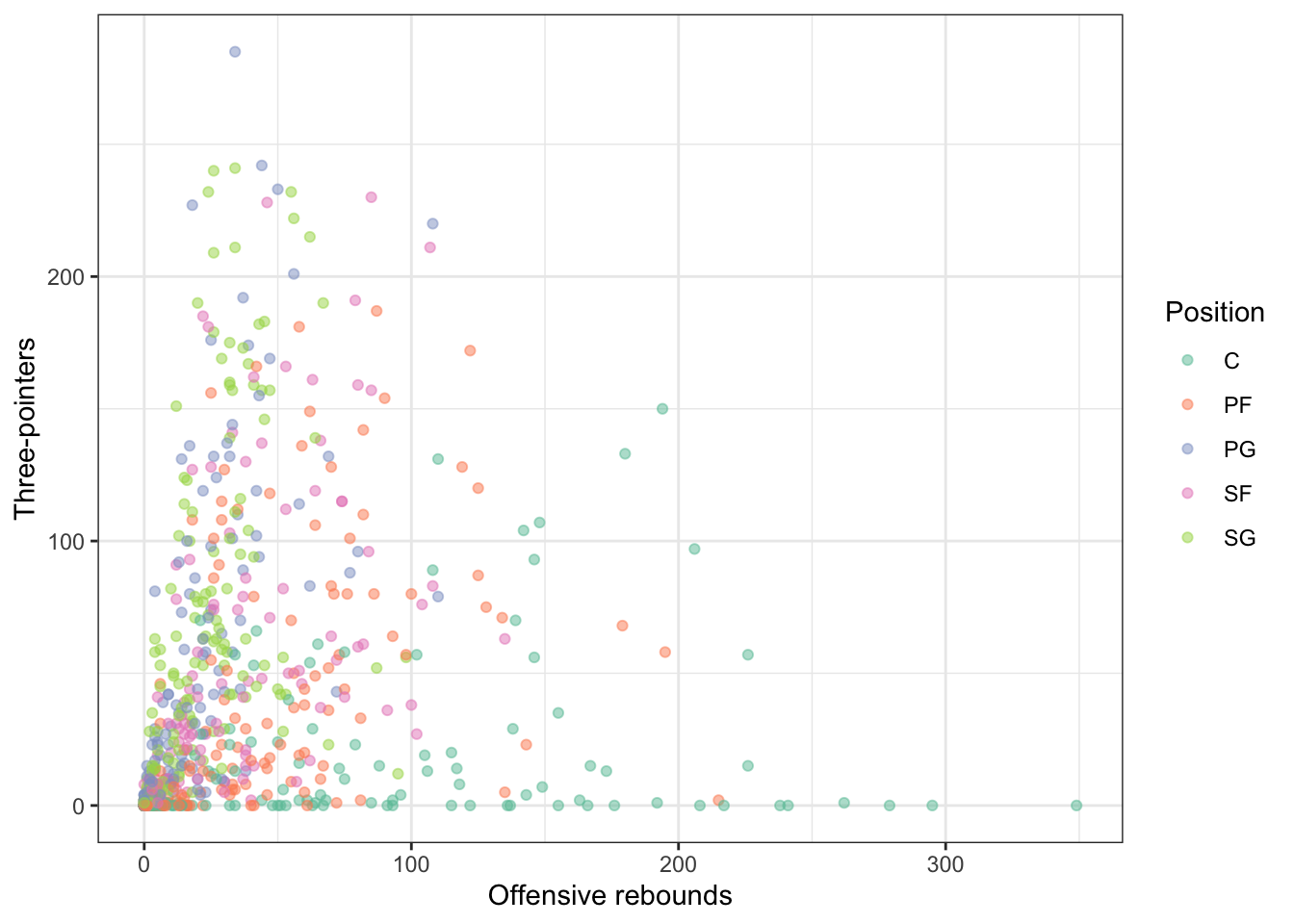
(HEALTH)
Alternatively, we can make a scatterplot with Cost on the y-axis and Duration on the x-axis and using the geom_point() layer with each point colored by Drugs:
heart_disease %>%
  ggplot(aes(x = Duration, y = Cost,
             color = Drugs)) +
  geom_point(alpha = 0.5) +
  labs(x = "Duration", y = "Cost",
       color = "Number of drugs") +
  theme_bw()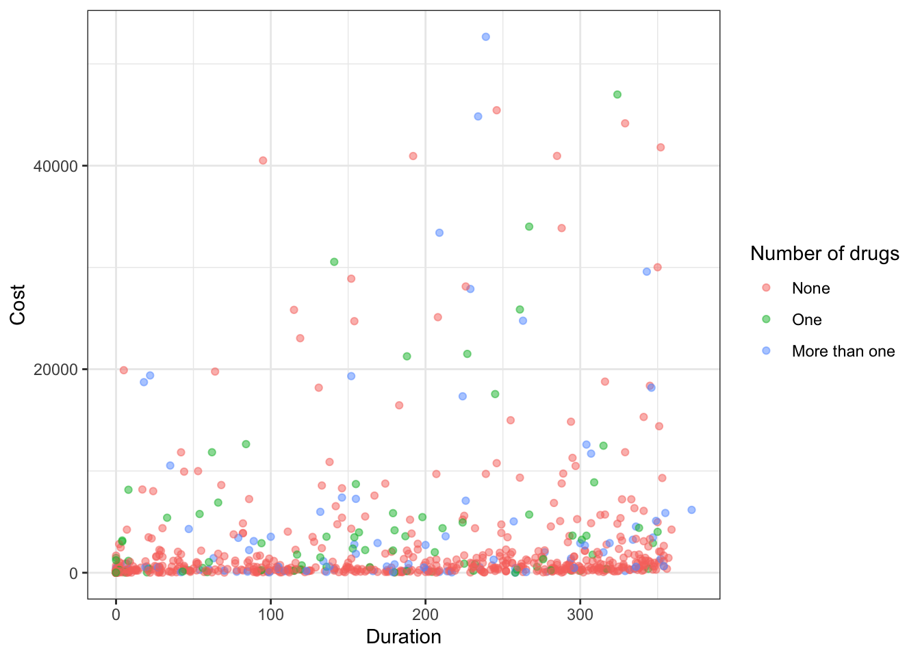
What does alpha change? We can change the color plot for this plot using scale_color_brewer() function:
heart_disease %>%
  ggplot(aes(x = Duration, y = Cost,
             color = Drugs)) +
  geom_point(alpha = 0.5) +
  scale_color_brewer(palette = "Set2") +
  labs(x = "Duration", y = "Cost",
       color = "Number of drugs") +
  theme_bw()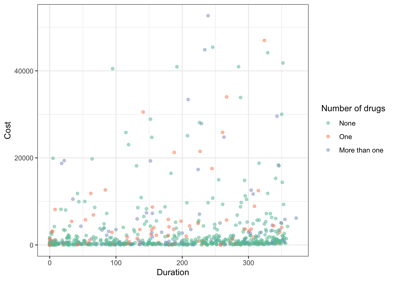
(ALL TOGETHER NOW)
Which do you prefer, the default palette or this new one? You can check out more color palettes here.
Something you should keep in mind is to pick a color-blind friendly palette. One simple way to do this is by using the ggthemes package (you need to install it first before running this code!) which has color-blind friendly palettes included:
(SPORTS)
nba_stats %>%
  ggplot(aes(x = offensive_rebounds, y = three_pointers,
             color = position)) +
  geom_point(alpha = 0.5) +
  # Notice I did not use library(ggthemes) to do this... just '::'
  ggthemes::scale_color_colorblind() +
  labs(x = "Offensive rebounds", y = "Three-pointers",
       color = "Position") +
  theme_bw()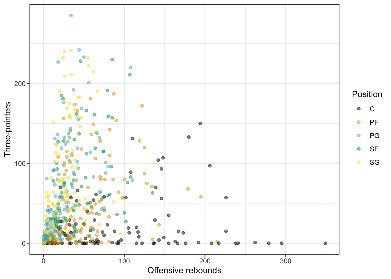
In terms of displaying color from low to high, the viridis scales are excellent choices (and are also color-blind friendly!). For instance, we can map another continuous variable (minutes_played) to the color:
nba_stats %>%
  ggplot(aes(x = offensive_rebounds, y = three_pointers,
             color = minutes_played)) +
  geom_point(alpha = 0.5) +
  scale_color_viridis_c() +
  labs(x = "Offensive rebounds", y = "Three-pointers",
       color = "Minutes played") +
  theme_bw()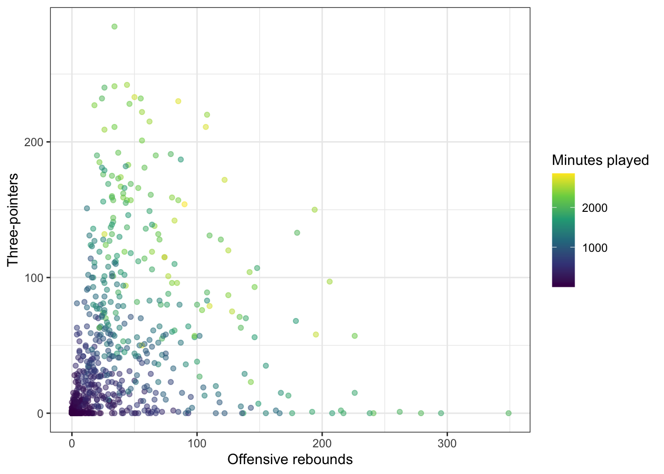
(HEALTH)
heart_disease %>%
  ggplot(aes(x = Duration, y = Cost,
             color = Drugs)) +
  geom_point(alpha = 0.5) +
  # Notice I did not use library(ggthemes) to do this... just '::'
  ggthemes::scale_color_colorblind() +
  labs(x = "Duration", y = "Cost",
       color = "Number of drugs") +
  theme_bw()
In terms of displaying color from low to high, the viridis scales are excellent choices (and are also color-blind friendly!). For instance, we can map another quantitative variable (Interventions) to the color:
heart_disease %>%
  ggplot(aes(x = Duration, y = Cost,
             color = Interventions)) +
  geom_point(alpha = 0.5) +
  scale_color_viridis_c() +
  labs(x = "Duration", y = "Cost",
       color = "Interventions") +
  theme_bw()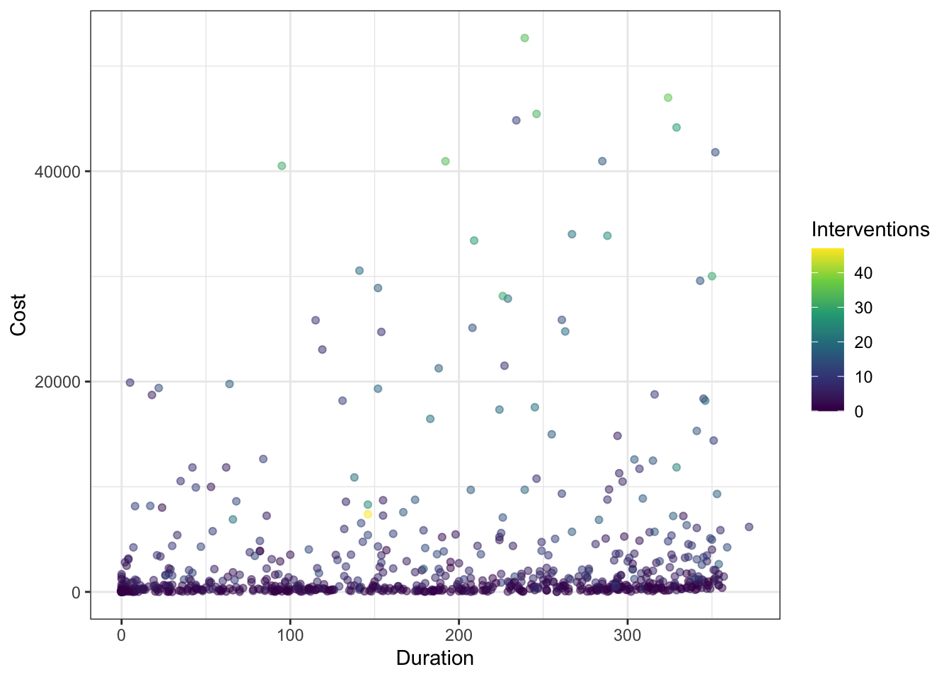
(ALL TOGETHER NOW)
What does this reveal about the plot? What happens if you delete scale_color_viridis_c() + from above? Which do you prefer?
Notes on themes
You might have noticed above have various changes to the theme of plots for customization. You will constantly be changing the theme of your plots to optimize the display. Fortunately, there are a number of built-in themes you can use to start with rather than the default theme_gray():
(SPORTS)
nba_stats %>%
  ggplot(aes(x = offensive_rebounds, y = three_pointers,
             color = minutes_played)) +
  geom_point(alpha = 0.5) +
  scale_color_viridis_c() +
  labs(x = "Offensive rebounds", y = "Three-pointers",
       color = "Minutes played") +
  theme_gray()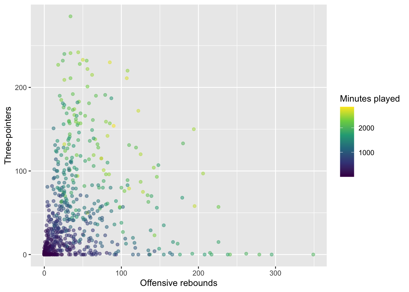
For instance, Prof Yurko prefers theme_bw():
nba_stats %>%
  ggplot(aes(x = offensive_rebounds, y = three_pointers,
             color = minutes_played)) +
  geom_point(alpha = 0.5) +
  scale_color_viridis_c() +
  labs(x = "Offensive rebounds", y = "Three-pointers",
       color = "Minutes played") +
  theme_bw()
There are options such as theme_minimal():
nba_stats %>%
  ggplot(aes(x = offensive_rebounds, y = three_pointers,
             color = minutes_played)) +
  geom_point(alpha = 0.5) +
  scale_color_viridis_c() +
  labs(x = "Offensive rebounds", y = "Three-pointers",
       color = "Minutes played") +
  theme_minimal()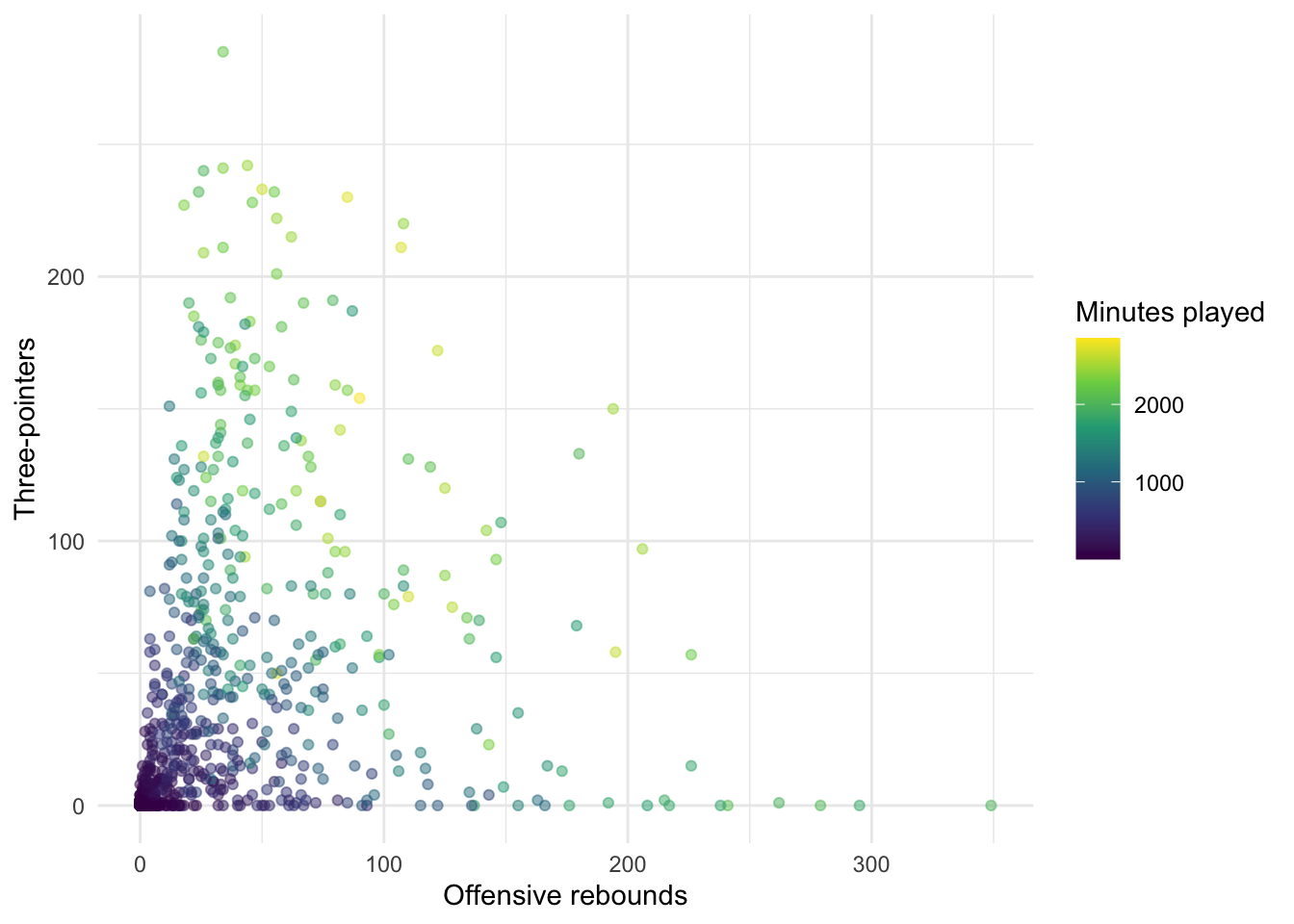
or theme_classic():
nba_stats %>%
  ggplot(aes(x = offensive_rebounds, y = three_pointers,
             color = minutes_played)) +
  geom_point(alpha = 0.5) +
  scale_color_viridis_c() +
  labs(x = "Offensive rebounds", y = "Three-pointers",
       color = "Minutes played") +
  theme_classic()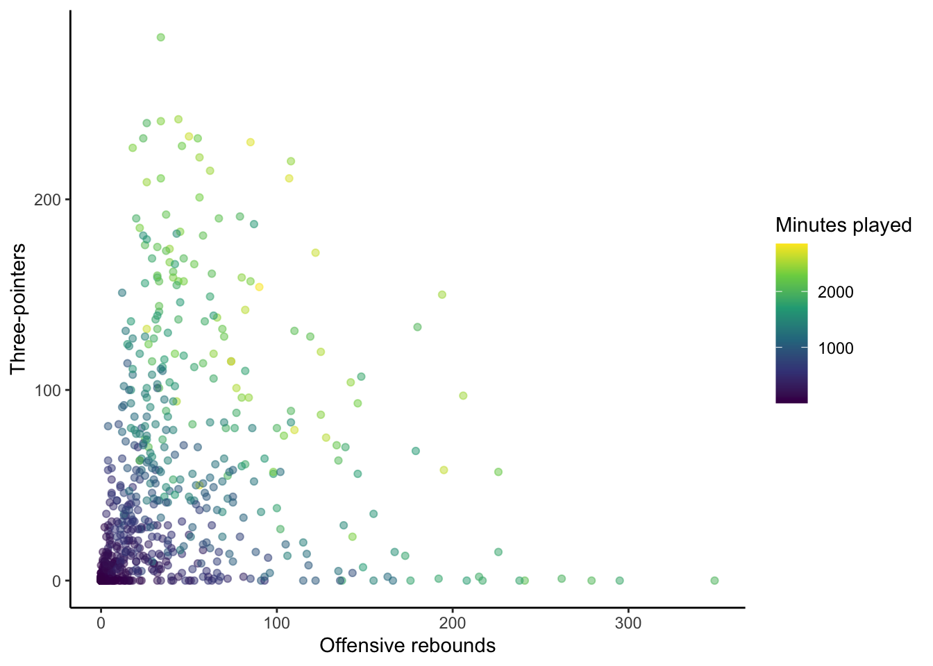
There are also packages with popular themes, such as the ggthemes package which includes, for example, theme_economist():
library(ggthemes)
nba_stats %>%
  ggplot(aes(x = offensive_rebounds, y = three_pointers,
             color = minutes_played)) +
  geom_point(alpha = 0.5) +
  scale_color_viridis_c() +
  labs(x = "Offensive rebounds", y = "Three-pointers",
       color = "Minutes played") +
  theme_economist()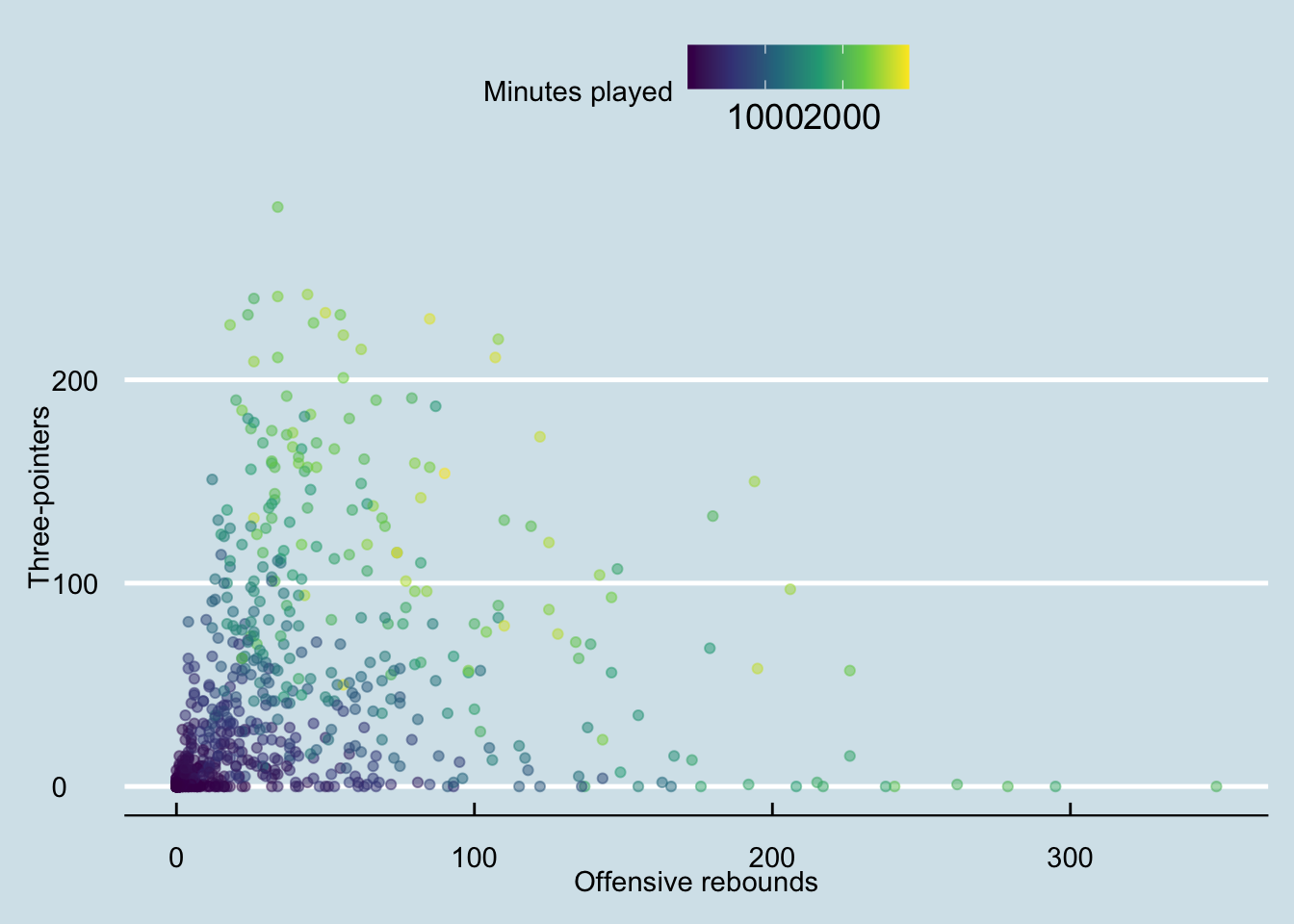
and theme_fivethirtyeight() to name a couple:
nba_stats %>%
  ggplot(aes(x = offensive_rebounds, y = three_pointers,
             color = minutes_played)) +
  geom_point(alpha = 0.5) +
  scale_color_viridis_c() +
  labs(x = "Offensive rebounds", y = "Three-pointers",
       color = "Minutes played") +
  theme_fivethirtyeight()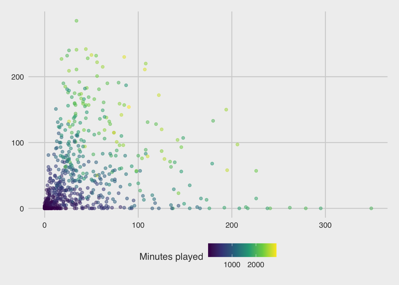
With any theme you have picked, you can then modify specific components directly using the theme() layer. There are many aspects of the plot’s theme to modify, such as my decision to move the legend to the bottom of the figure, drop the legend title, and increase the font size for the y-axis:
nba_stats %>%
  ggplot(aes(x = offensive_rebounds, y = three_pointers,
             color = minutes_played)) +
  geom_point(alpha = 0.5) +
  scale_color_viridis_c() +
  labs(x = "Offensive rebounds", y = "Three-pointers",
       title = "Joint distribution of three-pointers and offensive rebounds",
       subtitle = "NBA statistics from 2021-2022 season",
       color = "Minutes played") +
  theme_bw() +
  theme(legend.position = "bottom",
        legend.title = element_blank(),
        axis.text.y = element_text(size = 14),
        axis.text.x = element_text(size = 6))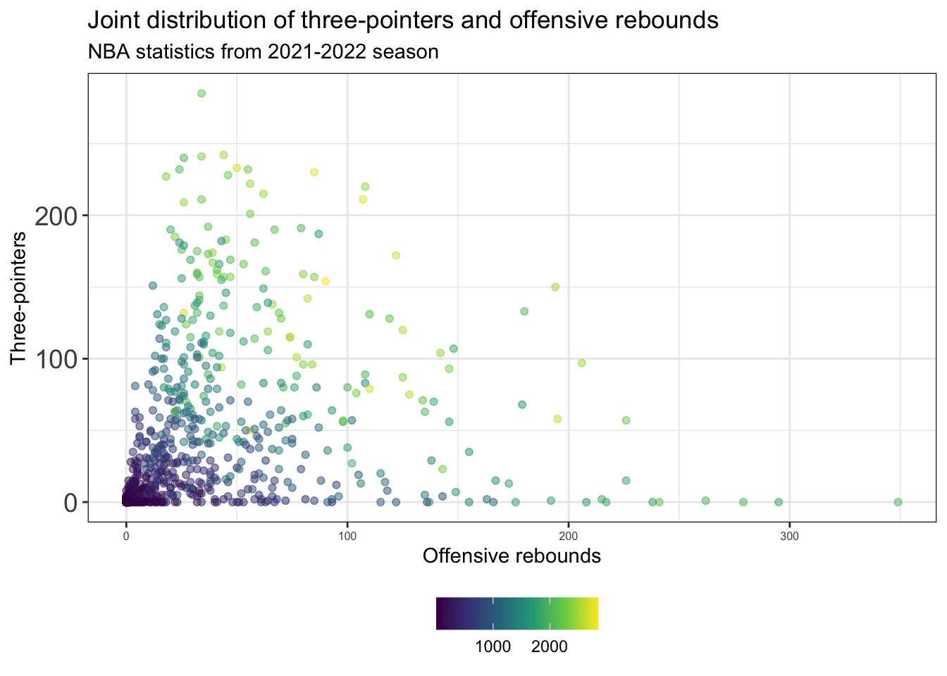
(HEALTH)
Starting with the default theme_gray():
heart_disease %>%
  ggplot(aes(x = Duration, y = Cost,
             color = Interventions)) +
  geom_point(alpha = 0.5) +
  scale_color_viridis_c() +
  labs(x = "Duration", y = "Cost",
       color = "Interventions") +
  theme_gray()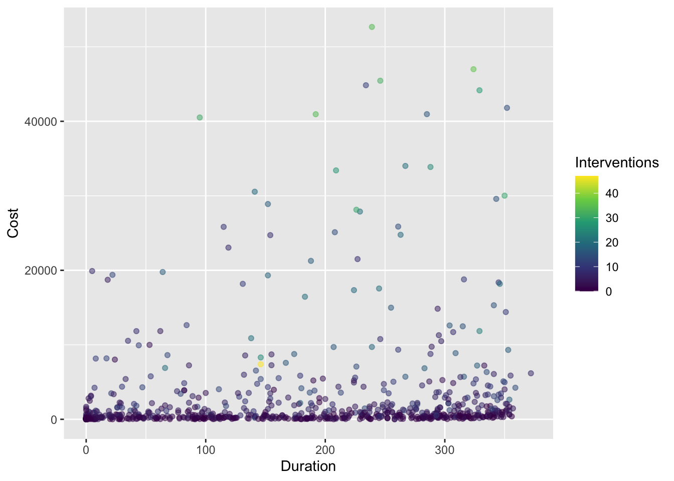
Many other themes are out there. For instance, Prof Yurko prefers theme_bw():
heart_disease %>%
  ggplot(aes(x = Duration, y = Cost,
             color = Interventions)) +
  geom_point(alpha = 0.5) +
  scale_color_viridis_c() +
  labs(x = "Duration", y = "Cost",
       color = "Interventions") +
  theme_bw()
There are options such as theme_minimal():
heart_disease %>%
  ggplot(aes(x = Duration, y = Cost,
             color = Interventions)) +
  geom_point(alpha = 0.5) +
  scale_color_viridis_c() +
  labs(x = "Duration", y = "Cost",
       color = "Interventions") +
  theme_minimal()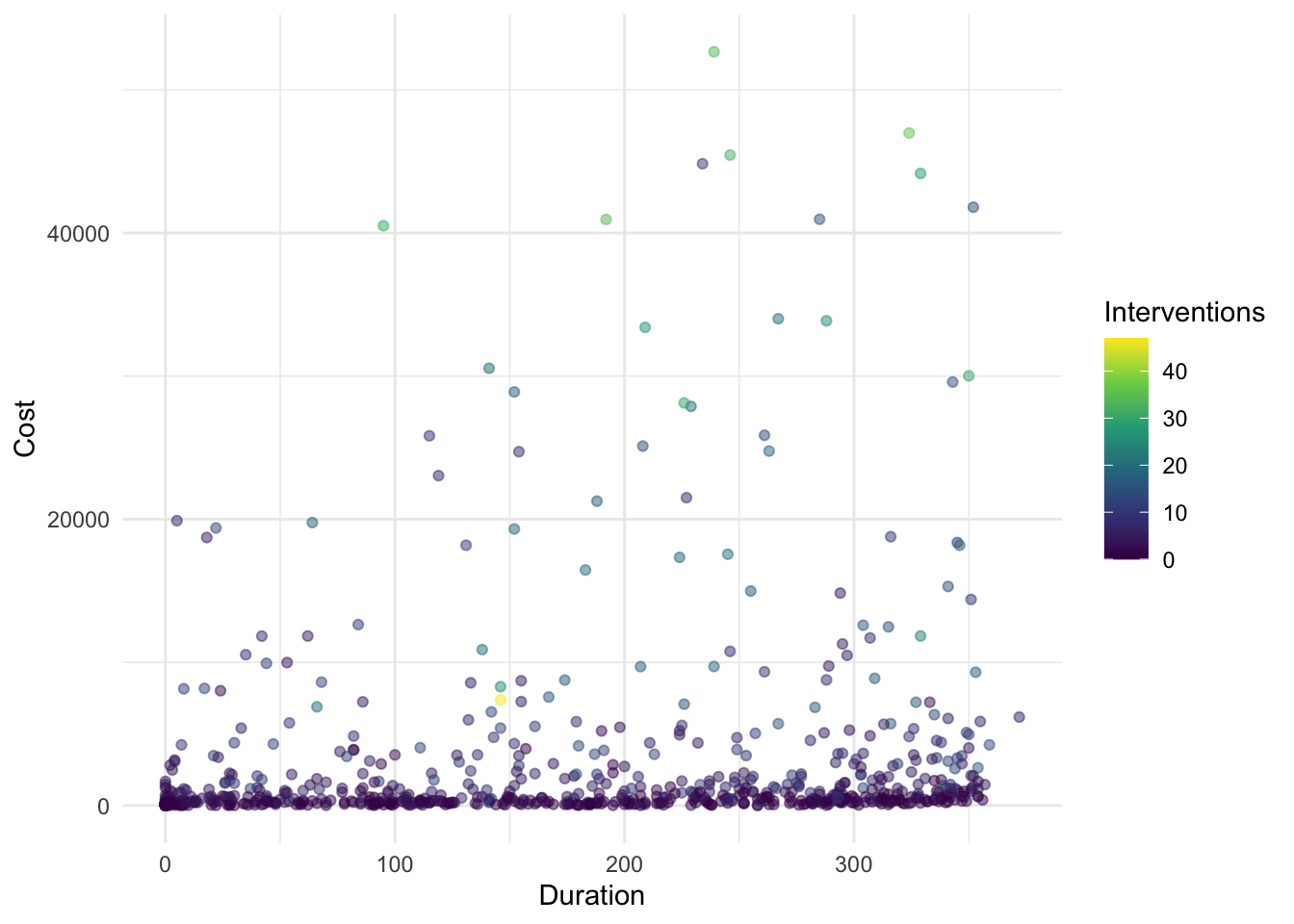
or theme_classic():
heart_disease %>%
  ggplot(aes(x = Duration, y = Cost,
             color = Interventions)) +
  geom_point(alpha = 0.5) +
  scale_color_viridis_c() +
  labs(x = "Duration", y = "Cost",
       color = "Interventions") +
  theme_classic()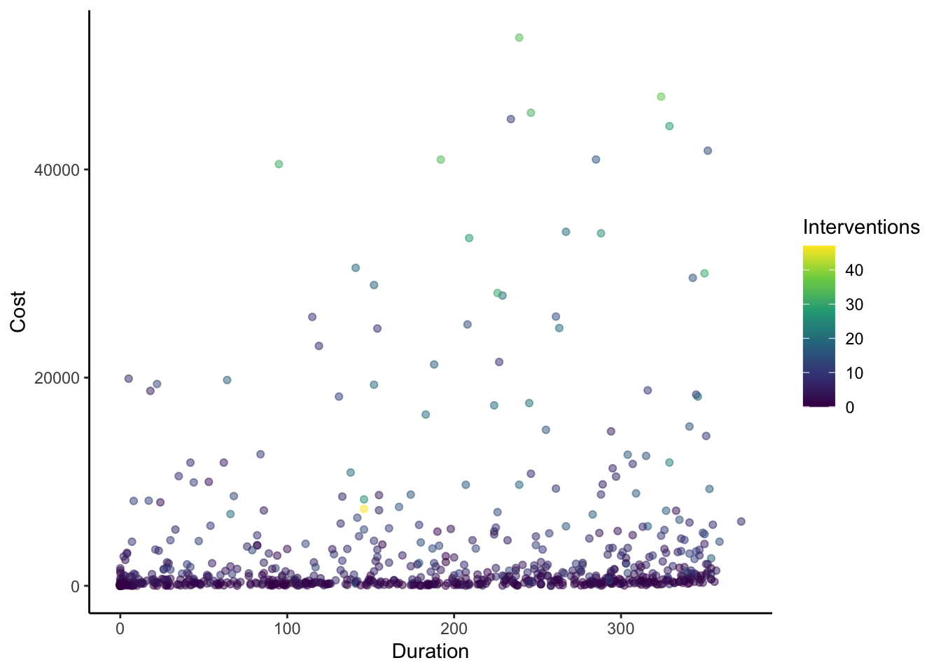
There are also packages with popular themes, such as the ggthemes package which includes, for example, theme_economist():
library(ggthemes)
heart_disease %>%
  ggplot(aes(x = Duration, y = Cost,
             color = Interventions)) +
  geom_point(alpha = 0.5) +
  scale_color_viridis_c() +
  labs(x = "Duration", y = "Cost",
       color = "Interventions") +
  theme_economist()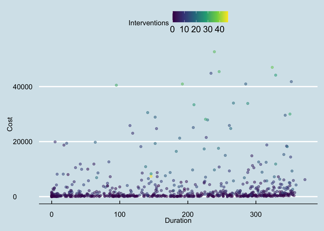
and theme_fivethirtyeight() to name a couple:
heart_disease %>%
  ggplot(aes(x = Duration, y = Cost,
             color = Interventions)) +
  geom_point(alpha = 0.5) +
  scale_color_viridis_c() +
  labs(x = "Duration", y = "Cost",
       color = "Interventions") +
  theme_fivethirtyeight()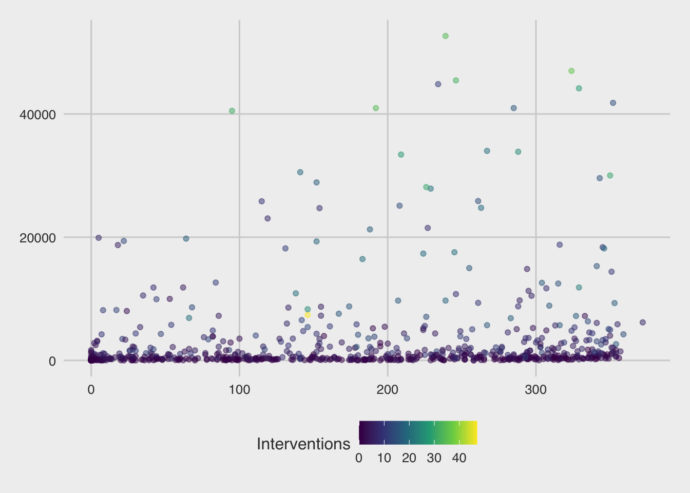
With any theme you have picked, you can then modify specific components directly using the theme() layer. There are many aspects of the plot’s theme to modify, such as my decision to move the legend to the bottom of the figure, drop the legend title, and increase the font size for the y-axis:
heart_disease %>%
ggplot(aes(x = Duration, y = Cost,
color = Interventions)) +
geom_point(alpha = 0.5) +
scale_color_viridis_c() +
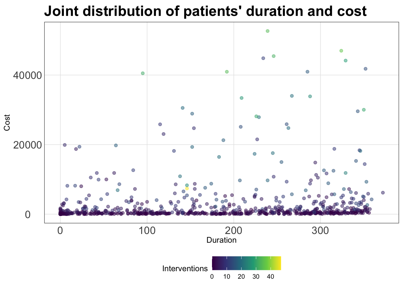
labs(x = "Duration", y = "Cost",
title = "Joint distribution of patients' duration and cost",
color = "Interventions") +
theme_bw() +
theme(legend.position = "bottom",
legend.title = element_blank(),
axis.text.y = element_text(size = 14),
axis.text.x = element_text(size = 6))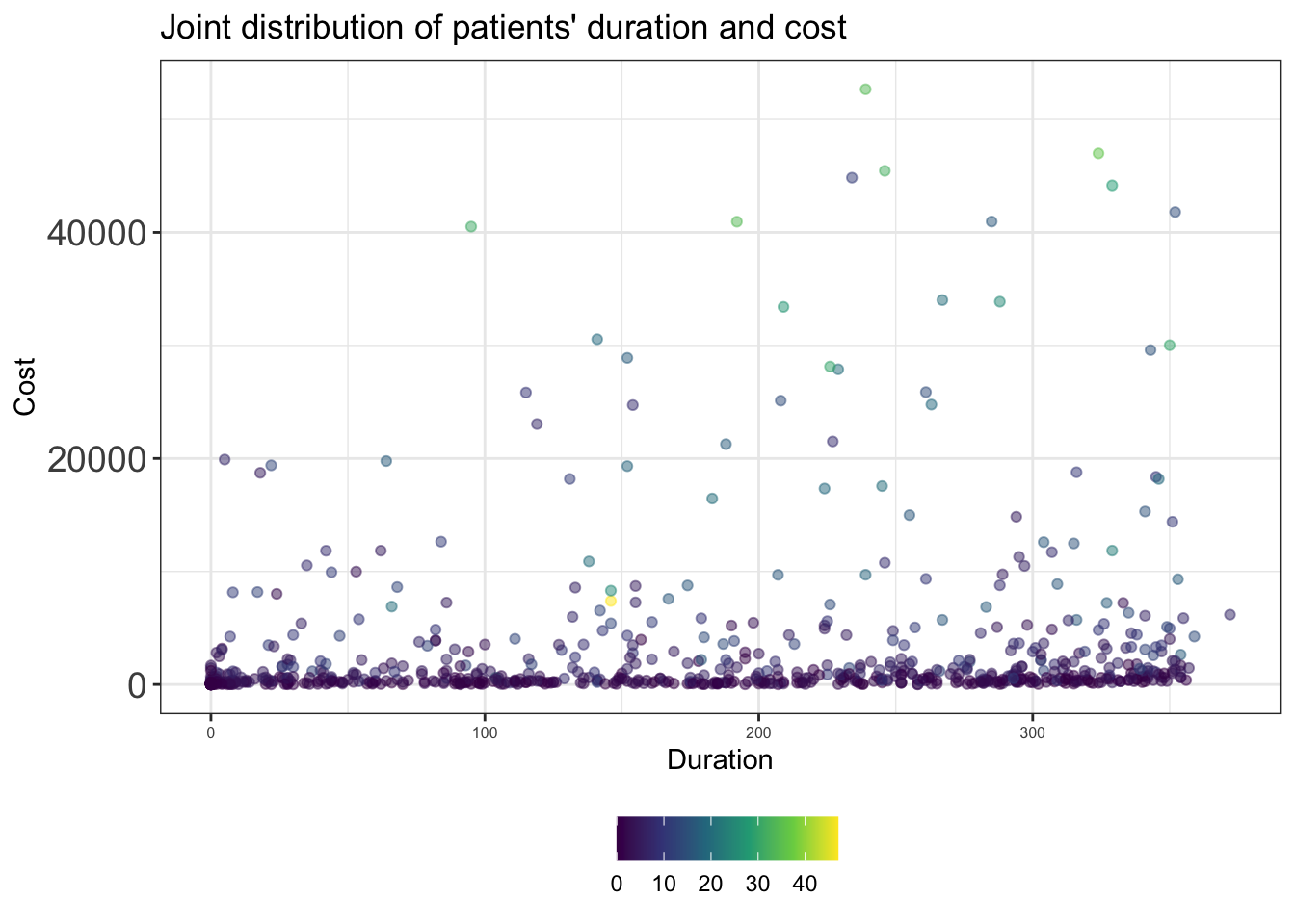
(ALL TOGETHER NOW)
If you’re tired of explicitly customizing every plot in the same way all the time, then you should make a custom theme. It’s quite easy to make a custom theme for ggplot2 and of course there are an incredible number of ways to customize your theme. In the code chunk, I modify the theme_bw() theme using the %+replace% argument to make my new theme named my_theme() - which is stored as a function:
my_theme <- function () {
  # Start with the base font size
  theme_bw(base_size = 10) %+replace%
    theme(
      panel.background  = element_blank(),
      plot.background = element_rect(fill = "transparent", color = NA),
      legend.position = "bottom",
      legend.background = element_rect(fill = "transparent", color = NA),
      legend.key = element_rect(fill = "transparent", color = NA),
      axis.ticks = element_blank(),
      panel.grid.major = element_line(color = "grey90", size = 0.3),
      panel.grid.minor = element_blank(),
      plot.title = element_text(size = 18,
                                hjust = 0, vjust = 0.5,
                                face = "bold",
                                margin = margin(b = 0.2, unit = "cm")),
      plot.subtitle = element_text(size = 12, hjust = 0,
                                   vjust = 0.5,
                                   margin = margin(b = 0.2, unit = "cm")),
      plot.caption = element_text(size = 7, hjust = 1,
                                  face = "italic",
                                  margin = margin(t = 0.1, unit = "cm")),
      axis.text.x = element_text(size = 13),
      axis.text.y = element_text(size = 13)
    )
}
Now I can go ahead and make my plot from before with this theme:
(SPORTS)
nba_stats %>%
  ggplot(aes(x = offensive_rebounds, y = three_pointers,
             color = minutes_played)) +
  geom_point(alpha = 0.5) +
  scale_color_viridis_c() +
  labs(x = "Offensive rebounds", y = "Three-pointers",
       title = "Joint distribution of three-pointers and offensive rebounds",
       subtitle = "NBA statistics from 2021-2022 season",
       color = "Minutes played") +
  my_theme()
Warning: The `size` argument of `element_line()` is deprecated as of ggplot2 3.4.0.
ℹ Please use the `linewidth` argument instead.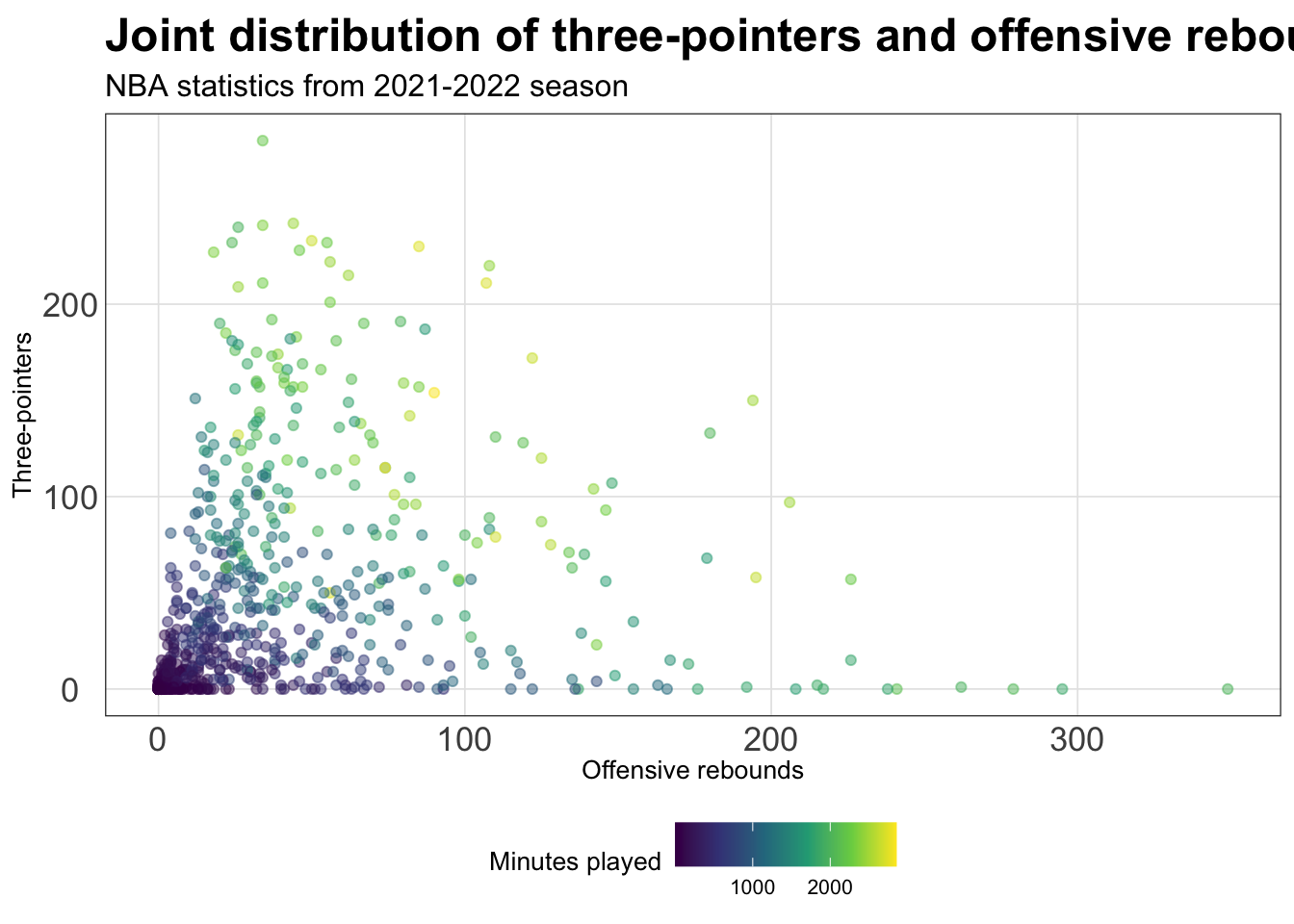
(HEALTH)
heart_disease %>%
  ggplot(aes(x = Duration, y = Cost,
             color = Interventions)) +
  geom_point(alpha = 0.5) +
  scale_color_viridis_c() +
  labs(x = "Duration", y = "Cost",
       title = "Joint distribution of patients' duration and cost",
       color = "Interventions") +
  my_theme()